VISUALIZING DATA AND ITS APPLICATION IN CYBERSECURITY

Imagine you are listening to a story or a podcast, your brain automatically starts creating the scene in your head. It starts wondering how it LOOKS. This is called visualization. In short, it is a process of displaying mental visual images. These visual images contain a lot of minute details about the scenario like how big or small, what are the shades of the color, the size of the objects, etc just like dreams. Our brain automatically looks at the images first whenever you surf through an article or a book as they are easier to understand and interpret.
Just like that, data is visualized to represent the information graphically. You paint a picture of your information and data to convey an idea or a message for your audience. This is done with the help of data visualization tools and techniques making it easier for your target audience to grasp and understand the content you are trying to express. We will discuss it in detail further. But first, let's find out why we need to visualize data?
POWER OF DATA VISUALIZATION

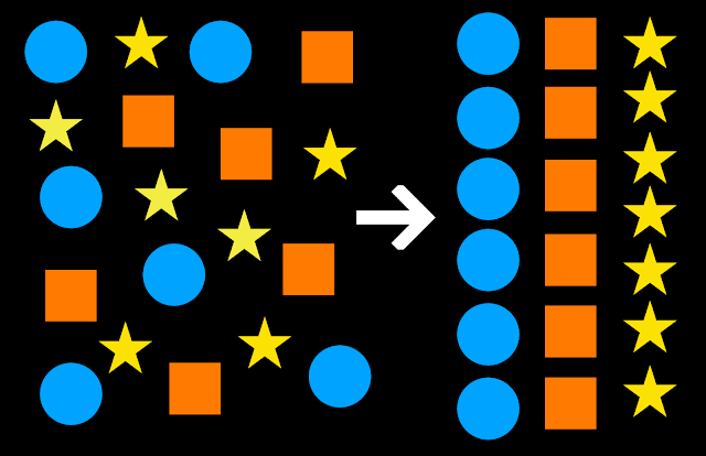
One look at a table with a large number of rows and columns may make it hard for our brain to process the amount of information in such a small amount of time. To make data easy to understand in the shortest amount of time possible, we display it in the form of graphs, charts, signs, symbols, colors, etc for our brain to interpret the main idea or the information faster and simpler. We explore, monitor and explain the data for the following reasons:
Images play a huge role to grab and maintain the audience's interest due to their ability to understand the information.
Data is made more available to access and understand easily with less inputs from the data scientist.
Because of the visuals, the job of creating insights and making decisions based on it becomes easier too.
Highlights key points and makes the data more memorable.
Helps in identifying and monitoring factors like outliers, patterns and trends to create predictions.
Easy to locate, format and manipulate important required information.
Fresh perspective on large amounts of data that can be missed which also helps to put data in the correct context.
Story telling of data in a short span of time.
Speeding up the decision making process with the help of insights/analysis for increasing productivity.
Spotting technical or human errors with the data or its analysis.
In the 1900s when the computer era emerged, the visualizations processing became more advanced and new techniques were discovered rapidly.
Today data visualization as a technique is used in so many sectors like healthcare, business intelligence, marketing, finance, ecommerce, education and much more around the globe.
HOW TO VISUALIZE DATA?
Tell the truth:

The main idea is to be honest and accurate with the data used. The mishandling of data can lead to miscommunication, false narratives and complications. It is necessary to use unbiased, relevant and true data to avoid future crises. In short, facts only!
Think about your audience:

Your audience includes all the members who are being presented with the data from stakeholders to team members to the people with no knowledge or background of the topic. Keeping this in mind, the visualizations must be created and presented as simple and relevant depending on the understanding levels of your audience. This also includes showing them what they want to see, preparing the answers to the questions or concerns they can have related to the visualization. Make sure the audience isn’t overwhelmed with the technical terms and tell an unforgettable story with the power of data.
Choose right kind of chart/graph:
.png)
After data analysis, the next step is to visualize it in the form of a chart/graph. Which chart or graph to use is decided on the basis of the problem statement and what message is to be conveyed. It is not mandatory to always use different types as some graphs express the data more effectively than the other. The goal is to present information correctly using the correct graph. More on that ahead!
Provide necessary context:

Assure the audience with the details they need to help understand the visualization further. Why, how and what are we trying to achieve are some of the questions that need to be answered. The title, headings, labels, signs and symbols used must be explained in a simple and clear way. The context is important for the audience to understand the visualizations better in order to create insights further.
Select and balance the theme of colors:
.png)
The color scheme selected must be able to grab attention as well as highlight and focus on the points we are trying to make with them. The colors must follow a theme palette using matching colors or shades to display patterns. Darker shades must be used to show higher frequencies and lighter shades to show low frequencies of the data. Contrasting themes can play a huge role in making an impact on the visualization.
Use simple, clear and concise formatting:

Pleasing to the eye and readable clear sizes of the elements must be used. Not too less or not too much data must be displayed at a glance. Only the required and the important data must be presented in appropriate sizes and shapes with less blank or white spaces. The graphs and title headings must be placed and formatted with respect to each other.
Focus on answering the problem statement:

This can be done by avoiding the use of extra context and enhancing on the essential elements by highlighting them. The insights displayed must be the solution to the question we are trying to solve can be achieved with good and simple design.
TYPES & TECHNIQUES OF DATA VISUALIZATION
You may have heard or even used some of the charts and plots like bar, pie, histograms, etc. They play a major role for visualizing data with the help of the tools. But which plot will help us tell our story in an interesting and perfect way?
When to use which chart and graphs? Let’s find out:
When you want to capture a trend:
.png)
Line Chart: When you have continuous numeric values, a simple line chart can be used to display the trend to show changes over time. Eg: google searches over time. Multiple lines can also be displayed for comparison of different features.
When you want to display fractions:
.png)
.png)
Pie Chart: The most common and popular way to display part to whole data like a round pie cut into pieces is pie chart. Eg. word document meme, market share, voting preferences. Variant of pie chart is donut chart with only difference being the hole in the center for better presentation and readability.
Heat Maps: They are two dimensional charts that use shades of color to represent trends in data. Eg.monthly temperatures across the year.
Treemaps: The 2D rectangles are proportional to the size of the value to display hierarchical structured data. Eg. stock prices comparison by industry and company
Stacked Column Chart: These charts are used to compare subcategories within categorical data and can also display percentages. Eg. total car sales by producer/per region.
When you want to visualize a single value:
.png)
Card: Mostly used to highlight an important value in live dashboards and presentations. e.g. sales revenue to date.
Table Chart: Mainly used on small data sets to display data in a tabular format. e.g registrations per webinar.
When you want to visualize relationships:
.png)
Bar and Column Chart: Bar chart is one of the easiest and quickest ways to compare categorical data where the categories are displayed on one axis and values on another. Eg. volume of google searches by region. Column chart is nothing but a vertical column chart.
Scatter Plot: It is used to display relationships between two features or variables. Mostly used to represent and identify correlations between the data points. E.g salary and years spent at the company of an employer.
When you want capture distributions:
.png)
Box plot: Displays the distribution of a variable’s summary statistics like quartiles and outliers in the form of a box. Violin plot, which has the shape of a violin, is a variation of the box plot. E.g time spent reading across readers. E.g time spent in restaurants across age groups
This was a glimpse of a few kinds of ways you can visualize your data!
TOOLS OF DATA VISUALIZATION
Here are some of the popular and widely used tools in the industry for visualizing and analyzing your data and datasets. You can input data columns and rows directly from various file formats as well as directly from databases.

DATA VISUALIZATION FOR R AND PYTHON CODERS
Packages like matplotlib, seaborn in Python and ggplot2 in R are most popularly used for data science. You can easily find documentation on respective API websites and also refer to cheat sheets for help and better understanding.


WHEN DATA VISUALIZATION MEETS CYBER SECURITY:
Data visualization can be applied for many industries and use cases. Let us discuss how data visualization can work wonders in the field of cyber security. Most common method to represent attacks through visualization is done by using the network graph technique.

Data visualizations in cybersecurity during threat analysis:
When big complex data like ip information and server logs is generated every millisecond in large numbers, it is time consuming for humans to process the data and identify patterns or missing values. Through visualization detection of this data, it will be easier to find hidden insights, important information and network vulnerabilities pre and post attack efficiently.
After generating insights, the detected threat can be divided into previously known malicious threats and new threats. Further they can be visualized into network graphs based on their geographical locations. A pie chart would be a great selection for displaying the percentage of attacks across the globe by countries/states. This can help us identify patterns and predict and prevent further actions. Based on the analysis, the threat can be sorted and filtered based on the priority level, web browsers used, etc. Now when the analysis step is complete, the next step is to investigate and take actions for the future. This step involves answering the questions starting with “who”, “what”, “when”, “where” and “how”. Hence, the network graph can also be visualized as a net in the sea full of information.

Here the groups can be made on the basis of common server attacks or geographical locations.
Insights that can be found from visualizing and analyzing a cybersecurity dataset
Log files of IP addresses of hackers trying to attack.
The number of attacks by date and time.
The percentage analysis of types of users - admin, host, etc
Attempted penetrations and top ten countries.
Finding out their location with Google Map API.
To explore more in detail you can check out and refer : https://cambridge-intelligence.com/data-visualization-techniques-for-cyber-security-analysts/
Now you know how “A picture is worth a thousand words”.
FOLLOW US FOR THE SAME FUN TO LEARN DATA SCIENCE BLOGS AND ARTICLES:💙
LINKEDIN: https://www.linkedin.com/company/dsmcs/ INSTAGRAM: https://www.instagram.com/datasciencemeetscybersecurity/?hl=en GITHUB: https://github.com/Vidhi1290 TWITTER: https://twitter.com/VidhiWaghela MEDIUM: https://medium.com/@datasciencemeetscybersecurity- WEBSITE: https://www.datasciencemeetscybersecurity.com/
- Team Data Science meets Cyber Security ❤️💙

Comments
Post a Comment